I never knew who I was. I still don’t know who I am. It doesn’t matter anyway.

  • 10 Posts
  • 118 Comments
Joined 1 year ago
cake
Cake day: July 13th, 2025

help-circle

  • Dæmon S.@calckey.worldtoTechnology@lemmy.world•*Permanently Deleted*
    link
    fedilink
    arrow-up
    15
    arrow-down
    2
    ·
    5 months ago

    @ennof@feddit.org @LuminousLuddite@lemmy.world @technology@lemmy.world

    As if it were a matter of caring or wanting/not wanting to use websites… It would be really nice to live in such a world where one could have the luxury of “choosing”. Unfortunately, it’s not this world for many people and many peoples.

    To exemplify this, there are websites I, as a Brazilian, can’t simply choose whether to use or not, because there are government and bureau websites for services through which I’m expected to comply with citizen things I didn’t ask for (as I didn’t ask to be born in this world to begin with). Online services such as “DETRAN” (state-wise transportation bureaus where one must renew one’s driver’s license), which I remember having to click a reCAPTCHA in order to proceed with transportation-related citizen duties. I can’t have the luxury of saying “you know what, I’m not renewing my driver’s license which has become my ID for a plethora of services not even related to driving, which means I’m going ID-less and becoming a legally-indigent person in the eyes of the next cop that requests my ID”.

    Hell, I can’t even choose to have a degoogled phone because our customs (Receita Federal) will likely deny the entry for any “unlicensed device” (i.e. devices not licensed by ANATEL, Brazilian telecommunication agency). And installing a custom ROM in any available device is not without the risk of bricking the device (and losing a monthly minimum wage worth of money spent with said device) especially for someone like me who never installed custom ROMs.

    Again, would be really awesome to live in the world you described where one could afford “caring to use” things…




  • @agamemnonymous@sh.itjust.works @artshare@lemmy.world

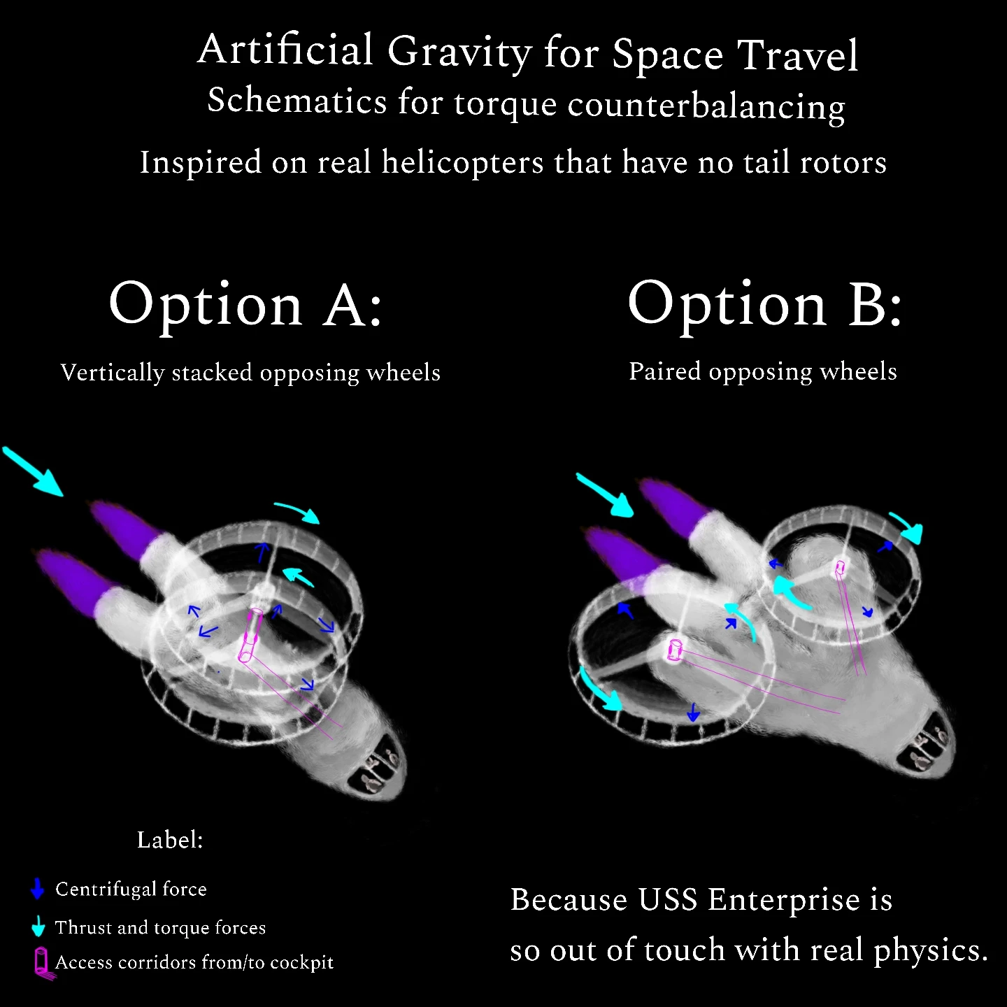
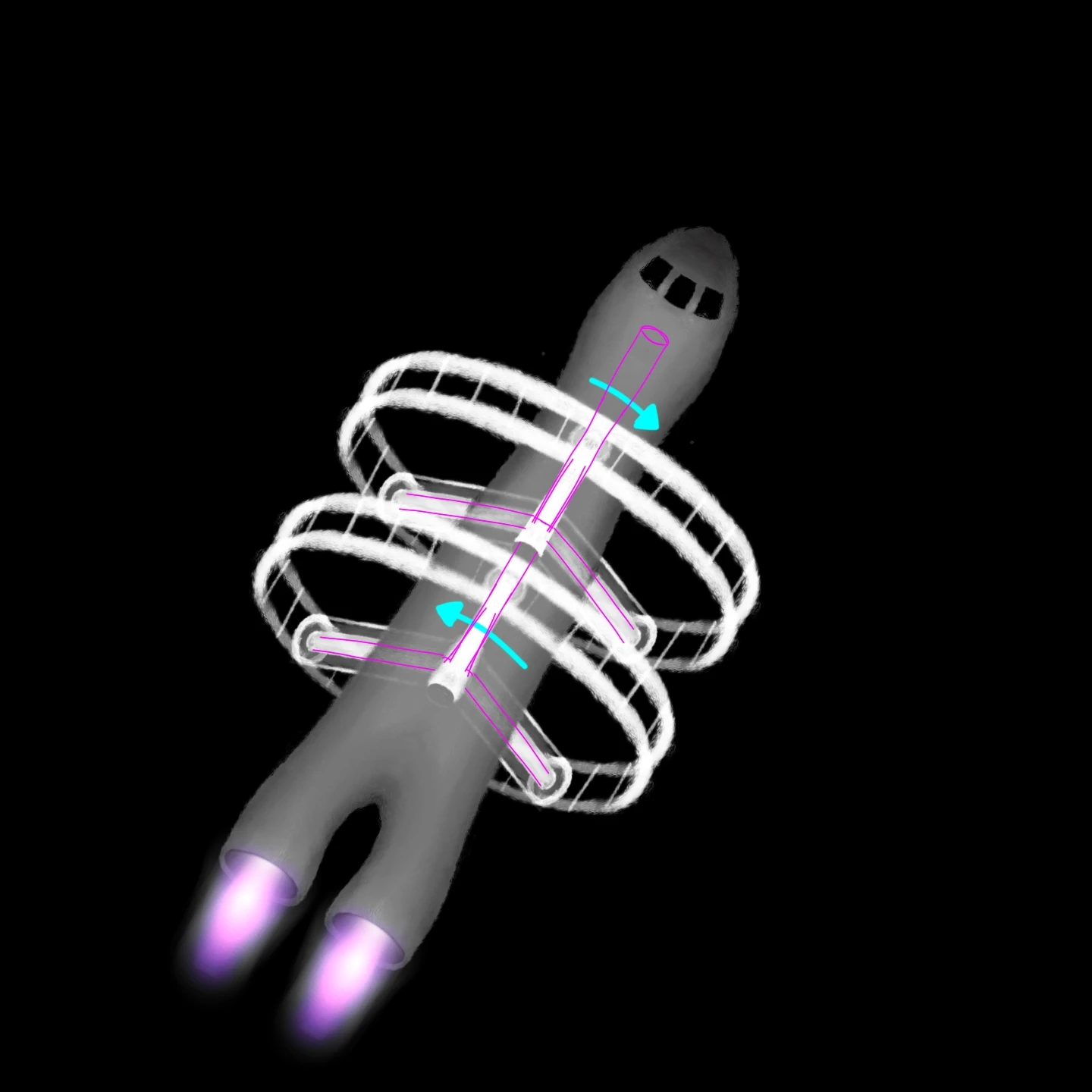
    This, with an additional caveat: it must be two (or more pairs, always an even number of) rings sandwiched on top of each other inside the so there’s counterbalancing of the torque, otherwise it’d be more of a reaction wheel.

    To be fair, most sci-fi shows seem to struggle with accurate mechanisms for gravity inside the ship, which is directly related to the ship’s size and shape… Which reminds me of how the ship from the Vogons (Hitchhiker’s Guide to the Galaxy) is, by far, the most unrealistic one, essentially being a gigantic cube inside of which the Vogons stand as they use loudspeakers (from the vacuum of the space) to announce their bureaucratic destruction procedures for Earth 😂

    Still, I’d say USS Enterprise is the most iconic spaceship to me.


  • @CIA_chatbot@lemmy.world @artshare@lemmy.world

    Back when I initially drew, I was thinking of some premises, including ionic thrusters (whose acceleration is knowingly slow) used only for changing the ship’s course which would essentially be wandering naturally (and unhurriedly) towards deep space, after being built in orbit (much akin to how ISS was built) then towed to orbit near escape velocities by detachable stages before leveraging gravitational assist, like the Voyagers did. In this sense, the centrifuge would be used during free roam through deep space, when the ship isn’t accelerating on its own. Also, the crew would be small (up to a dozen, but ideally three or five people, or an odd numbers of people), which would be floating in microgravity inside the rest of the ship (esp. the cockpit) most of the time.

    But thinking about your design, rings around the ship instead of ships above/below the ship, yours is a better design than mine, because it’d also include a more efficient connection hallway to/from the rest of the ship.

    I tried to draw it, keeping the pair of counterbalancing rings:

    A drawing of a similar spaceship as my previous drawing, in similar view (isometric, 60 degrees) but it's just the drawing and the force vectors on top of it, and the ship now has a different configuration for the rings, in which the wings are actually surrounding the ship's body, rotating in the same axis as the ship's roll axis, although one ring rotates to opposite direction that of the other ring. The purple light from ionic thrusters is slightly improved, with me using a glow brush from Sketchbook to make the ink additive (therefore closer to a light) rather than subtractive. The three astronauts aren't visible through the cockpit's windows.


  • @Adderbox76@lemmy.ca @artshare@lemmy.world

    You’re astronauts would be puking 24/7

    Lol

    the rings are way too small

    Indeed, the scale in which I depicted the idea isn’t accurate and, in reality, the whole thing should be way bigger, which means the astronauts would be barely visible from outside the cockpit’s windows.

    At least in a mental model, if these models had larger dimensions than they’re currently implied to have, the spaceship’s body/hull would end up heavier than the rings, even when the rings are also scaled up, because the volume and the surface of the hull is implied/expected to exceed those of the rings, whose materials should be “truss-like” (i.e. hollow) for these to be lighter than the ship’s hull.

    But, welp, it’s been a long while since I tinkered with Kerbal Space Program.


  • @panda_abyss@lemmy.ca @artshare@lemmy.world

    To a certain extent, yes… but I guess it will depend on factors such as the length and the weight of the rings, the weight of the gravitating things sitting on the inner part of the rings (this would be, by far, the biggest contribution to imbalance, no matter the configuration of the rings, as different things, including people, with different weights would be standing on different places across each centrifuge) and the dimensions of the spacecraft, wherein the center of mass tends to be, even with both rings. In option A, the rings are supposed to be as closest as possible to each other, with enough gap for them to rotate without friction.

    The main imbalance I can see is during ship’s rotation, especially roll and pitch, given how both configurations only account for yaw balance. So the ship must be as stationary as possible in relation to itself, only changing its attitude when really needed, and doing so in the slowest pace possible, no hurry needed. That’s also why I placed ionic thrusters instead of traditional rocket engines, as ionic thrusters are known to push things really slowly. This spaceship is meant to accelerate extremely slowly.

    After I draw this schematics-art, I thought of further configurations, such as Option B with the rings inside a larger husk (so the ship would become more aerodynamic, while also adding some structural strength and weight to further dampen the torque imbalance). Another alternative, for the Option A, would be four rings instead of two, with a pair on the top (as it currently is) and an additional pair on the bottom, which would make the center of mass to match the center of mass of the ship’s hull.


  • @artshare@lemmy.world

    As per requests, the final art is included below.

    Alt-text:
    Picture of the final art originally drawn in the time-lapse, depicting a close mugshot of a feminine face meant to be a safe depiction of Lilith (demoness-goddess in occultism; here, Her more potentially disturbing features such as horns, wings, blood and hollow dark eyes are replaced by a more womanly anthropomorphic depiction which has just the pointy canines, a.k.a vampire fangs, but without the blood, as the most explicit supernatural trait).

    She is depicted as having brown skin, soft triangular face with tender blushed cheeks and round nose, dark red lips from an open mouth that reveals both her subtly-vampiric teeth and a tongue whose tip slightly touches the middle of the upper teeth, large almond-shaped eyes with expressively feminine eyelashes, wide pupils and reddish-brown irises (looking directly at the viewer), as well as a long and almost vivid red straight hair cascading onto Her shoulders (which are partially visible, featuring the clavicle bone and subtle relief from muscles and tendons in the neck).

    The background is just a solid black color.

    Picture of the final art originally drawn in the time-lapse, depicting a close mugshot of a feminine face meant to be a safe depiction of Lilith (demoness-goddess in occultism; here, Her more potentially disturbing features such as horns, wings, blood and hollow dark eyes are replaced by a more womanly anthropomorphic depiction which has just the pointy canines, a.k.a vampire fangs, but without the blood, as the most explicit supernatural trait). She is depicted as having brown skin, soft triangular face with tender blushed cheeks and round nose, dark red lips from an open mouth that reveals both her subtly-vampiric teeth and a tongue whose tip slightly touches the middle of the upper teeth, large almond-shaped eyes with expressively feminine eyelashes, wide pupils and reddish-brown irises (looking directly at the viewer), as well as a long and almost vivid red straight hair cascading onto Her shoulders (which are partially visible, featuring the clavicle bone and subtle relief from muscles and tendons in the neck). The background is just a solid black color.


  • @acockworkorange@mander.xyz @artshare@lemmy.world

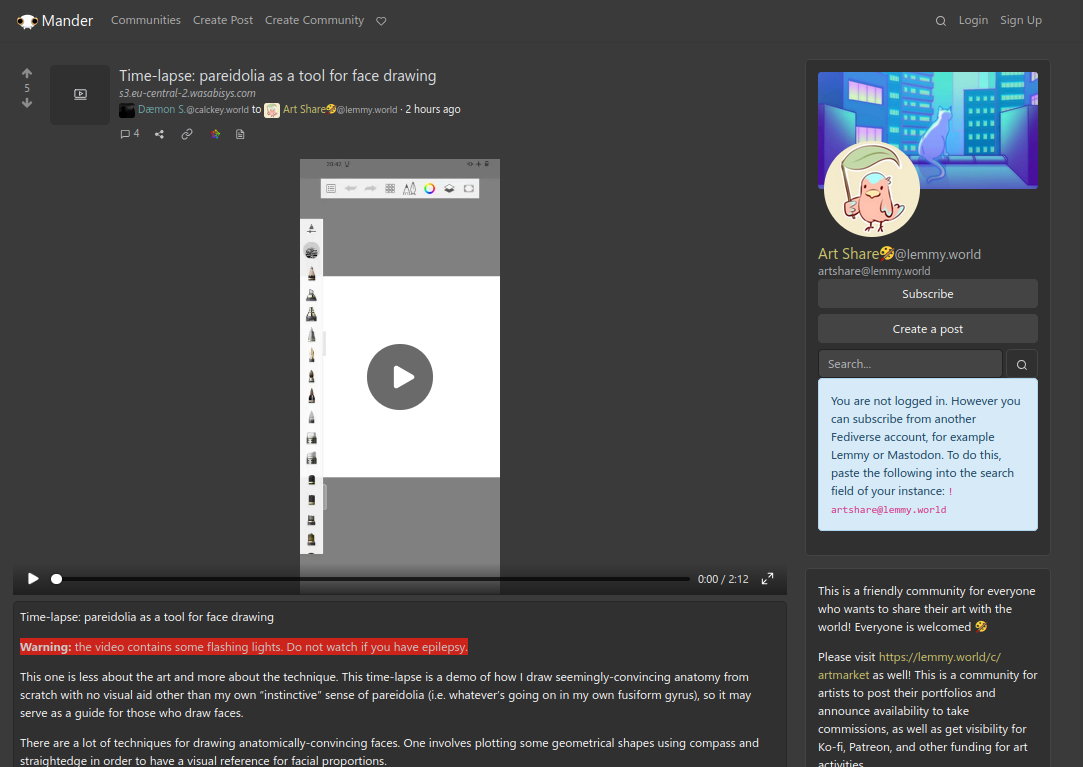
    Seeing from the Web UI of the Lemmy instance you’re from (Mander) yields a still frame of a paused video (hence, neither a GIF nor auto-played; the video being brought as GIF is a Mastodon thing, and even there, it’s not auto-play-enabled by default) which, despite appearing above the text in your instance, is sitting right above a bold-stylished “Warning” line, the text’s second line which couldn’t be the first line precisely because the first line is meant for the post’s title.

    Maybe you’re using some third-party app for accessing Lemmy, but even then, there are settings to turn off auto-play and, for most Lemmy clients (such as Voyager), it’s turned off by default just like the Lemmy’s original WebUI, except if you deliberately changed the settings and turned it on.

    Screenshot of this thread, as seen from Mander Lemmy instance, with the video as a still frame inside a HTMLVideoElement, neither a GIF nor auto-playing. My second line "Warning" is highlighted by me to show how visible it is within the post.


  • @CallMeButtLove@lemmy.world @artshare@lemmy.world

    Sorry, I didn’t quite understand what you meant due to the seemingly irony in the way you phrased your reply… are you asking for the picture of the art I drew in the video or, to the contrary, you’re saying that the drawing I made during the time-lapse ended up as overly unsettling? (when the alt-text beforehandedly told how my art was meant as the depiction of an entity Who’s originally from occultism and demonolatry)

    If it’s the latter, well, this depiction of Hers is the most family-friendly one my mind could conceive, the only potentially triggering thing being Her fangs… Maybe the eye contact can be triggering to some people? (but, then, I explicitly mentioned my art as a “close mugshot” of a “feminine face” “meant to depict Lilith”) In any case, that’s why I wrote the post so the alt-text is duplicated (both as actual alt-text for the media, and as a explicit disclaimer before the embedded media can be played, as I mentioned to another person in the comments).

    If it’s the former, I didn’t initially post the final art because this is post is more about the technique (described in-text and illustrated in-video) than the drawing per se but, sure, I can post the final art as a reply to this thread if you people want it :)


  • @acockworkorange@mander.xyz @artshare@lemmy.world

    The NSFW tag, as implemented by the platform I use (Calckey), while having some interop with Lemmy (hence one of the reasons why I use a Calckey acc instead of a Lemmy acc), ends up hiding my post even from myself as an OP.

    I mean, last time I NSFW-tagged a post of mine, I couldn’t see my own thread from Lemmy.world, as Lemmy requires login (signing-in with a Lemmy account, which I haven’t) to turn off Lemmy’s default NSFW filtering. Therefore, marking my post as NSFW rendered me completely unaware whether there were any pending-federation replies and/or reactions, because NSFW-tagged posts can’t be found as a Lemmy guest.

    Also, “Not safe for work” is too broad of a label, often mistaken for “pornography” and/or “violence”, hence why Lemmy (and most social media platforms) hide these by default…

    Ideally, I’d use Calckey’s “Content Warning” field, where I can explain where the sensitiveness is. But, then, Lemmy doesn’t recognize Misskey’s CW field, just the boolean sensitive key, hiding it even from myself and potentially breaking federation for reactions.

    Then there’s the char limit, which in my case necessarily includes the title and the CC (the mention to the community handle). Lemmy uses the first line of the post body to derive the title for posts originating from non-Lemmy platforms, so the title accounts for body length. If you measure how many chars my post has, including the formatting and the handle mentioning the community, you’ll realize I topped the 3000 chars configured in the Sharkey instance I’m in. I can’t help but write a lot due to my AuDHD nature, so I needed to prune things from my originally lengthier text; if I pruned more things to fit a NSFW in the title as well, the text would end up incomplete (and the title would end up lengthier).

    Finally but more importantly: when showing a thread, Lemmy (and most Fediverse platforms) usually brings the text content before the attached media, especially when it’s a video, which initially appears as a still of the first frame.

    My textual content isn’t sensitive, nor is the “video thumbnail”, just the way the video flashes for being a sped-up recording when (and if) it’s played.

    And, when it comes to a typical Lemmy UI, the video will only play if, and only if, the person deliberately clicks it (that is, when auto-play is turned off, which is the default for web UIs from most Lemmy instances). Given how the text comes before the video and the warning got this pretty visible, bold font format, I guess it’s enough for someone who’s sensitive to flashing lights to consume just the text while refraining from watching the time-lapse.

    I see you’re neither this community’s mod (Zombiepirate) nor the lemmy.world’s admin (ruud, who’s also the admin of calckey.world), so I’ll let it for actual mods and admins to decide if my post is sensitive: if they decide my post isn’t adequate and must be removed, okay, fair enough.


  • @artshare@lemmy.world

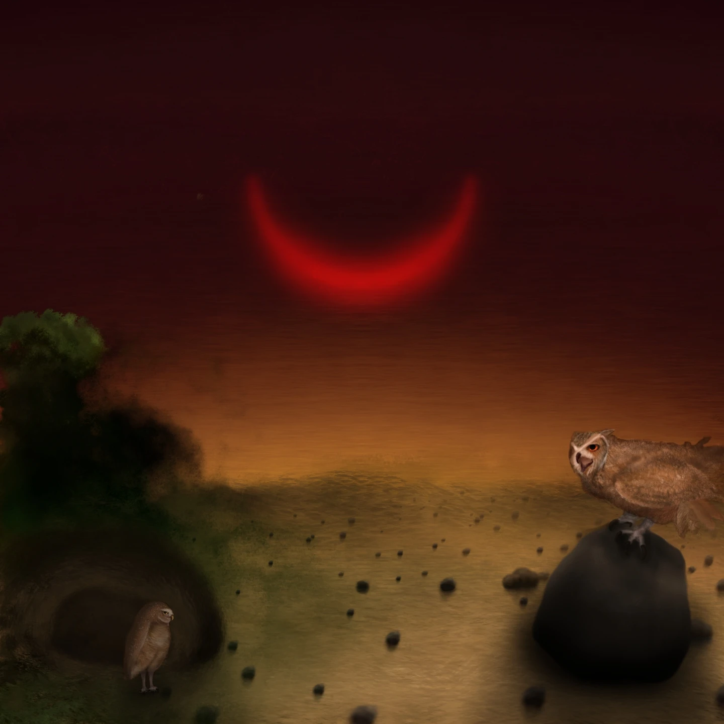
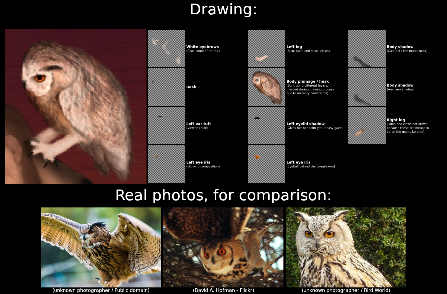
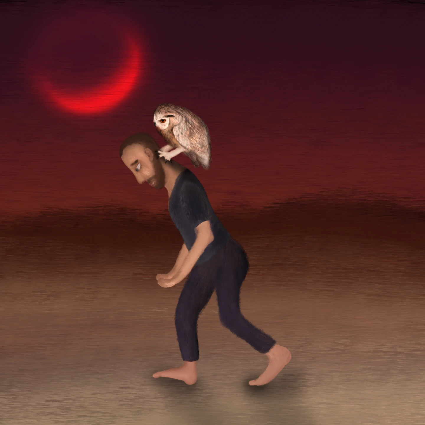
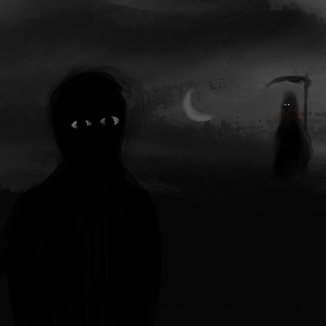
    Bonus: I built a behind-the-scenes layer disclosure, followed by a comparison between the drawing and real photos of Bubo ascalaphus.

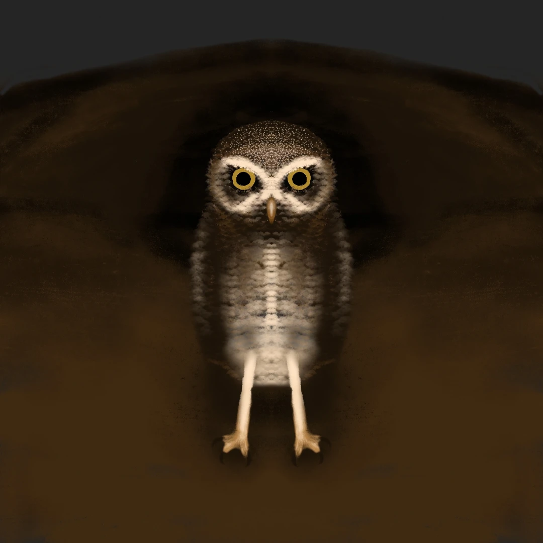
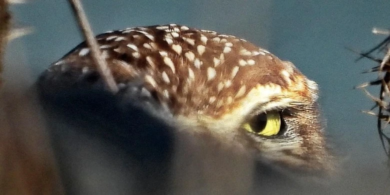
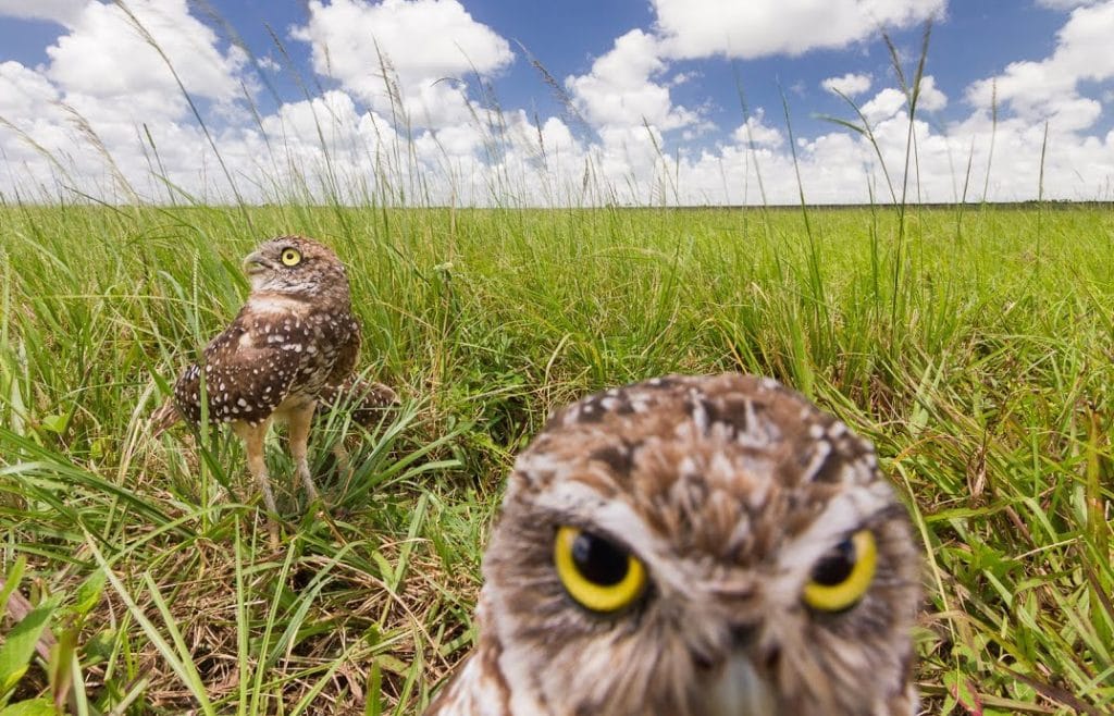
    The real photos are included so anyone, regardless of knowing this specific species, can have a visual reference to compare and notice the origin for each specific aspect seen in the drawing. It seems overly specific to depict the exact species/genus among many, because it is: my intention was to depict a very specific, Bubo ascalaphus owl, just like my previous art was intended to depict an Athene cunicularia owl. The reason is because both species and their genera have very specific, symbolic (and esoteric/religious) meanings to me.

    For the layer disclosure, I exported my Sketchbook project as a .psd (Photoshop file, because the layers within the Sketchbook’s .tiff project file are only recognized by Sketchbook itself), then I imported it using GIMP, then I isolated each layer specifically building up the depiction of the owl (other layers are related to other parts of the art such as the man, the landscape, the sky and the crescent moon), then I copied each layer against a transparency mesh pattern and rearranged them into the diagram-like arrangement you see.

    A diagram-like picture containing both the behind-the-scenes for the art (at least the most important parts, the layers building up the depiction of the owl) at the top half of the diagram, as well as three real photos of the owl species, for visual comparison. For the behind-the-scenes, each of the 11 owl-related layers, sorted by their original layered order, are labeled and explained, respectively: white eyebrows, beak, left ear tuft, glowing aspect of the left eye iris, left leg, body plumage/husk, left eyelid shadow, left eye iris eyeball, primary body shadow, auxiliary body shadow and right leg). For the comparison, I tried to find Public Domain photos. The second photo isn't exactly Public domain (CC-BY-NC-ND, hope cropping it at the owl and mirroring it to match the drawing's leftwards orientation isn't "derivative"). Owls are pretty much polymorphous so the comparison between my drawing and photos from the real species can differ on certain nuances.