Lots of great changes have been added by our growing team of contributors as highlighted below. If you want to join the team come and say hello at the team discussion on Matrix
Please note that some lemmy servers are still under pressure, so you may see unexpected error messages.
Updates should appear on TestFlight and Play Store today.
v0.10.6 Release
iOS:
- TestFlight (will be visible later today)
Android:
- GitHub
- Play Store
- If you want to stay up to date with the latest releases before it gets on Play Store or F-Droid, checkout Obtainium
Hello everyone! We heard you about the the full height preview issues. Just some context we were trying to fix some scroll jittery issues on the card view feed and one approach was limiting the preview height however turns out that’s a desired feature so we’re going to re approach the problem so we can keep full height images in the preview.
Change log
- Bring back full height preview in card view
- Fixed iOS photo orientation for uploads
- Added horizontal scroll to post title in navbar like RIF had
- Accessibility enhancement for upvote/downvote
- Small bug fixes
What’s coming
- Comment Style customizations
- Push notifications - we’re gonna balance this and take our time on our approach as we want to maintain privacy focused permissions.
- Ultra compact view. Really we will be adding a 3rd view type so we will have card, list, and compact. The current compact view will become list
This app is gold!!!
Thank you for how quickly you are reacting to user requests! Really exceptional work.
I was annoyed by the image height fix, but not annoyed enough to complain at you about it because I’ve seen how hard you’re working and there are more important things in life. That said, absolutely love that you listened to people on this! The full preview is a major selling point over some other apps, imo.
With notifications, if push will take a while (whatever, I don’t like using those anyway) is there any chance we’ll see some kind of indicator on the bell icon before then or will both of those be coming at the same time? It’s a bit weird having to just keep checking randomly to see if there’s anything there. Not a dealbreaker, I’m just curious about the plan :)
Big thanks as per usual!
The bell badge icon was in this release!
Aaaaaaaaaaaaaaaaaaaaaaaah!
Thank you :D
deleted by creator
AHHH full hight images are back! - Thank you so much for bringing it back
Phew, that was a close one! I almost went to touch grass, thanks for listening to your users and for the quick fix, devs!
Once you hit v 0.10.10 (10/10) please take a break! Thank you for the updates by the way.
Nice 👍🏼
Accessibility enhancement for upvote/downvote
Thank you for this!
❤️
This is such a wonderful app. The progress is incredible, and the app is so enjoyable to use.
Thank you!
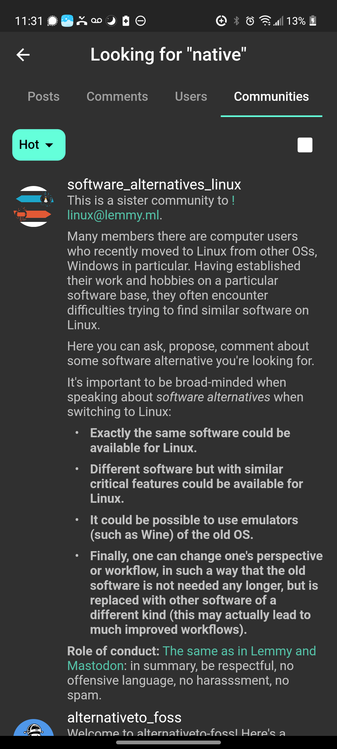
After trying all that are available, I use this and Jeroba. Super good job here! I think I would useitt full time if comminities listings were not so large:
That and post multiple photos on one post. But I have yet to see that done anywhere
You can add multiple images into the body. Does the site allow multiple media links? I didn’t know that.
Great point on how we handle the length of some community descriptions. Needs improving for sure.
If I could have one ask: Left-hand mode. Move pictures to the left as well as buttons to interact with posts, or allow up/downvote by dragging the comment.
Great point. I’ve seen this requested before so I’ll see if we have an issue and if not I’ll raise one.
Best app period
Thanks for your work on this app, really enjoying it so far. I know alot of people wanted full height image previews back, but I personally hate it. Is there a way to disable it?
We had a lot of discussion about this feature among the devs and full height definitely gets much more approval. If you can give some specific issues that the full height gives you, we can see if there’s a way to solve them.
I think full height images results in less density of posts on each screen and too much scrolling. It’s annoying to scroll past extra long images that I wouldn’t have clicked on in the first place. Any portrait pictures or phone screenshots take more than a full screen to get past when you factor the header and footer. It just feels like there needs to be a middle ground between compact view (can’t see enough of an image) and full view (scrolling past huge images that take up your whole screen). Thanks for coming to my Ted talk.
Yes, there’s still scope for improvement here. Once we’ve got some of the other issues with posts resolved we will be looking at this. In the meantime, keep working that thumb 😀
Such a good app and it’s getting better and better. I like how it handles having multiple accounts and really appreciate the notifications for replies/messages. Thank you!
thanks for your work!
Keep up the great work!


